Responsive Web Design
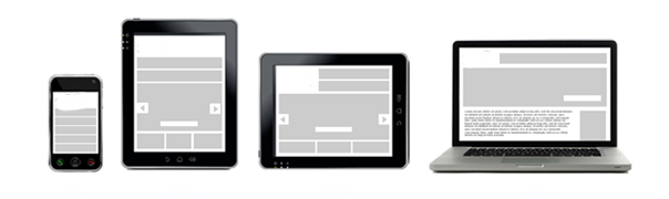
In the world of print design, media specifications are static. The designer knows the size of the page, how colours will look, how things will be laid out, and can work safely within these parameters when crafting their work. The world of web design is historically a bit trickier than that, since it is more difficult to anticipate the specifications of the end user’s display such as screen size, browser type, operating system, and so on. With the development of mobile devices and tablets, the plot thickens. Websites now need to instantly adapt to many more display contexts than ever before, and the future holds no sign of letting up on this demand.
The development of CSS (Cascading Style Sheets) helped designers create more flexible sites that would alter their shapes depending on desktop screen size and resolution. Now, with the latest version of CSS3, web design is drawing inspiration from the world of art and architecture and moving beyond simply being flexible by becoming responsive. Essentially, the concept of responsive web design enables web designers to give a kind of intelligence to their sites, allowing them to gather information on what type of device they are being displayed on through what are called media queries. This allows the site to actively respond to its display device and alter its appearance accordingly.
SOURCE: http://css.dzone.com/articles/responsive-web-design via http://mediaqueri.es/
This powerful innovation gives the website the ability to seamlessly display across a variety of devices, breaking free from the constraints of the desktop world without having to exist in many separate versions. One website enhanced with this code becomes a shape-shifter that removes the ever present worry from a site owner’s mind of how it will appear to users on various platforms. For a business owner, this is absolutely crucial –if your site doesn’t load properly or displays badly, your potential clients will bounce. This is especially vital on mobile devices, when people are looking for information on products or services on the go.
As usual, The Blue Hat web design team is on top of these developments and incorporates them into their practice in order to keep our clients ahead of the curve. Every business owner is looking for the any edge they can get in the fast-evolving online and mobile world, and taking advantage of cross-platform innovations is a great boost to any modern business.


Post a Comment
You must be logged in to post a comment.